
It’s 2023 and the time is right to start using color on engineering drawings.
For as long as I’ve been in the industry engineering drawings have been produced in two colors: black and white. Apparently back in the day they were blue. We haven’t come very far.
When drawings needed to be printed out on paper (and later copied, also on paper) this made some sense. Color printing was expensive and you wouldn’t want critical information to get lost in the process of copying from color to black and white.
But now we’re using fancy electronics with screens that can display millions of colors… to look at 2-color drawings.

Let’s do better! Here at CopelandBEC we’re experimenting with using color on our drawings in a few different ways—all with the goal of better communicating design intent and, ultimately, producing better outcomes in the built world.
One way we are exploring the use of color is to highlight the function of certain materials within an assembly (check out this post for more on why it’s better to focus on function than on specific materials). In the screenshot below, which is a working prototype we’ve been playing with, the colors mean the following:
- blue = water control
- yellow = thermal control
- green = air control
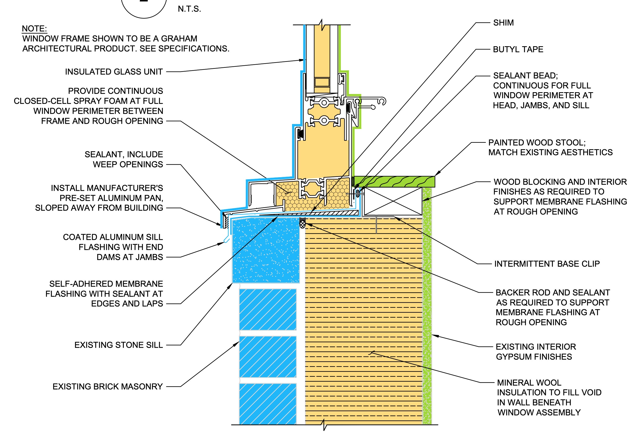
By identifying the intended function of each material in this way we hope to accomplish several things, including:
- clearly identifying any gaps in continuity of the various control layers in the design stage
- creating a better-defined goal for the installer (i.e. more than just “put this stuff here”, we’re trying to convey the message of “create a continuous airtight assembly here”)
This is a work in progress and just an illustration of our thinking on one way the use of color could be helpful on engineering drawings. Do you have ideas? We’d love to hear them in the comments below.
Want more down-to-earth building science and “how to build better” discussion? Please subscribe! I promise no spam and you can unsubscribe anytime.
Talk to a building envelope consultant
We help owners, design teams, and attorneys think through roofing, commissioning, and litigation questions. Tell us about your project and we’ll point you in the right direction.
Schedule a consultation